
Supporters’ association issues statement after criticism of away kit
1 min readEarlier this week, PSV unveiled the new away kit for the 2026/2027 season. Among the largest part of the crowd, there was a lot of criticism of the white shirt featuring orange, pink, and purple accents.
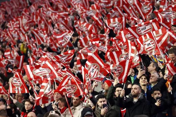
In particular, the fact that the logo is not in the traditional red-and-white can upset many supporters. For many fans, it is sacrilege to have the club logo displayed in other colors on the kit.
This has also been noticed by the PSV Supporters Association. Through a statement on social media, they are showing their response to the criticism coming from the supporters about the new shirt.
''Of course, we do not determine what future shirts will look like. But we do feel it is important that the voices of supporters on this issue are heard'', reads, among other things, in this statement.
The supporters association headlines 'Tastes differ, but logos don't' and writes underneath it, among other things: ''As with virtually every new kit, opinions about the latest kit are also divided. Tastes differ, and that's logical. But what we notice is that many reactions are not only about the design of the shirt, but above all about the choice to (again) execute the PSV logo in a different color.''
In addition, the supporters’ association also states that these signs are recognisable. ''For many supporters, the club logo is more than just part of a shirt design. The red-and-white logo is an important part of the identity and history of our club. That is precisely why many supporters believe that the club logo, regardless of the colour or style of a kit, should always be used in its original red-and-white version'', among other things.
Below is the full statement that the PSV Supporters Association has shared on social media:


Comments5
bruh, ik zie al voor me hoe de eerste 10 minuten iedereen weer screenshots post van dat roze en paarse spul. En dan doen alsof het om "identiteit" gaat, terwijl het gewoon design is. Maar oké, als het jullie heilig is dan is het jullie heilig... lol 💀
Ik vind dit statement best fair. "Smaken verschillen, maar logo's niet" is eigenlijk heel helder, want over het ontwerp kun je discussieren, maar de identiteit moet je bewaken. Hopelijk stuurt PSV dit ook door richting de kitmakers.
Wit met oranje, roze en paarse accenten is al een statement, maar die logo-kleur is de echte irritatie. Voor mij voelt het logo dan minder als identiteit en meer als decor. Ik ben benieuwd of ze dit nog aanpassen.
Tbh snap ik de frustratie wel. Als het PSV-logo ineens niet rood-wit is, voelt het voor mij gewoon alsof het niet klopt. Maar goed, smaken verschillen en de supportersvereniging pakt het netjes op.
Tbh ik snap de kritiek wel. Als "Smaken verschillen, maar logo's niet" klopt dat gewoon, PSV hoort rood-wit. 👀