
PSV counters criticism: “When it comes to clothing and fashion, a lot of people have a different opinion.”
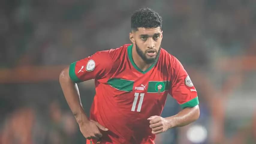
1 min readIt will most likely not have escaped anyone that PSV presented its new away kit on Tuesday morning for the 2026/2027 season. The new away shirt is white with orange, pink, and purple shades worked in.
On social media, the new kit received a lot of criticism from PSV supporters. Some fans even talk about it as the ugliest PSV shirt ever when they discuss the new away kit.
That also didn’t go unnoticed by Arne van Breugel, manager of merchandise at PSV. In the radio program KEIgoeiemorgen by Omroep Brabant, Van Breugel addresses the criticism that the new shirt is receiving.
''We don't like that there are so many negative reactions. Nobody likes that. We do this in good faith. Of course, you would rather have only positive reactions. It takes a lot of time to make such a shirt—over two years. For the sake of context: we are currently working on the design of the shirts for the 2028/2029 season. About two months ago, we gave Puma the first briefing for that shirt. In July, we'll see the first designs,'' the merchandise manager tells Omroep Brabant.

With the new kit, PSV has aimed to reach a younger audience, Van Breugel explains. ''The shirt we presented on Tuesday has less to do with the club’s history, and is set up to be more fashion-oriented, to reach a younger audience. When I walked this morning to my workplace in the stadium, I came across two girls and a boy on bicycles who were all three wearing the new shirt. I think it is still beautiful that you can see the shirt in that way already one day after the launch.''
Still, the manager merchandise understands as well that not everyone is always satisfied with a particular shirt. ''We have noticed that over all those years. When it comes to clothing and fashion, a lot of people have different opinions'', said Van Breugel.
In addition, he also has an opinion about the new third kit that will be worn this season and has been designed by a PSV fan. ''That shirt has no reference to the shirt that we presented yesterday. It is a completely different shirt, again for a completely different target audience,'' concludes the merchandise manager.

Comments5
"Over kleding en mode hebben heel veel mensen een andere mening" ja klopt, maar bij PSV verwachten we ook gewoon iets herkenbaars. Dit is in ieder geval niet meteen iconic, meer mid.
Bro breng het gewoon dichter bij de clubkleuren, dit voelt meer als lifestyle dan voetbal. Wel grappig dat hij zegt dat hij het al na een dag op straat ziet, maar dat kan ook gewoon hype zijn 😂
Arne zegt dat het jeugdiger moet, maar imo als het dan meteen "lelijkste ooit" wordt op social, schiet je je doel voorbij. Wel respect voor de 2 jaar ontwikkeling, maar dat maakt het design niet automatisch goed.
tbh ik snap de kritiek wel. wit met oranje en die roze paarse tinten voelt voor mij gewoon random, niet PSV.
i snap de kritiek best, het is echt een statement shirt. maar 2 meisjes en een jongen die het al dragen zegt ook wel wat hoor. als het werkt voor de jeugd, dan is het niet alleen om ons oude PSV-gevoel te pleasen.